
Using their own house price index data, this interactive visualisation was created for Rightmove, to show the trends of house prices across the different regions of the UK.
The user can click and drag the markers across the timeline to compare which regions have seen a rise or fall, between the dates specified. By hovering over the regions, more detailed data is revealed about the average house price and the change in percentage for that area.
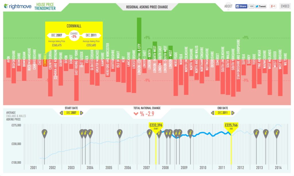
The trends and changes in house prices are often intrinsically linked to external socio-economic factors. Information markers are plotted along the timeline, containing short snippets of news and facts, outlining events that may have affected the housing market over time.